CSC 2530 - Final Project
3D Textured Paint
George ElKoura
The Paper [922k PDF]

 |
Project Description |
The purpose of this project is to enhance current image-based painterly rendering techniques to produce paintings of images that look more "3D". That is produce images that look like an oil painting that can be lit with any number of lights. This work is an extension of the work on painterly rendering by Hertzmann et al. We extended their work in the following ways:
While we implemented one of the frame-to-frame coherence techniques for video as described in [3], we didn't extend their work in this area. Most of the effort was concentrated on developing a 3D look for the generated painting. Those results are very promising. This web-page is intended to generally display the approach and the results of the project. The paper [922k PDF] describes the project in more detail. |
|
Arbitrary Brush Nibs |
|
In order to allow the user to specify a displacement map for the brush nib, it becomes also important to support arbitrary shapes for the nibs. Allowing arbitrary shapes does not simply imply rendering each stroke with whatever input the user supplies. We also need to use the derivative information of each stroke in order to properly line up the nib with the stroke curvature. To see why this is necessary consider a nib that is non-symmetric. Now imagine sweeping the nib along a curved stroke. The non-symmetric parts of the next nib will overwrite parts of the previous nib. Clearly this is not acceptable, especially when we are specifying a displacement height map. For more details on implementing arbitrarily shaped brush nibs, please refer to the paper. We require the user to supply only one plane representing both the shape and the height of the nib. We do this by simply setting a threshold on the luminance of the nib. If a pixel is above a certain luminance threshold, then that pixel contributes to the shape of the nib. The luminance values are used as the height of the nib at each pixel. To illustrate this, consider the following brush nib.  It is simply a blurred circle with some noise. When sweeped along a curve, we expect to see a stroke that is raised in the middle and falls off on the sides. We took the following texture map of a stroke:  And rendered it (with its luminance as a displacement map) to get the following result (click for a more detailed version): 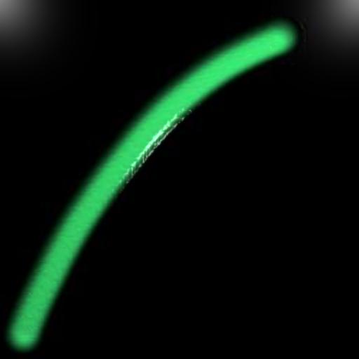
The above stroke was rendered with a much greater height than we would use in our algorithm for generating a painting. It is done for illustrative purposes only. |
|
Simulating Real Paint |
|
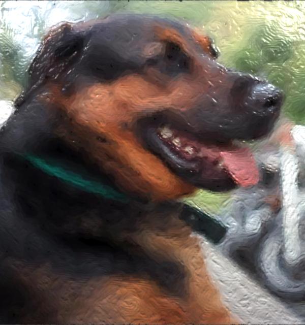
The original inclination was to generate normal information for each brush stroke then use simple bump-mapping techniques to render out a painting that is "correctly" lit with a 3D look. This was unfortunately more troublesome than anticipated. The main problem was that the user had to at least supply the normal information for the brush nib. Without a modeling package designed for this purpose, most users (including me!) would give up in despair before getting results that looked good. Automatically generating normals for the nib based on luminance is also not ideal since, at best, it imposes restrictions such as symmetry, and at worst produces normals that are simply wrong. Another approach proved to be much more promising. Instead of generating normals for each stroke, we instead generate a displacement map. Displacement maps are similar to texture maps, but instead of modulating color, they modulate point positions on the geometry. So in the color plane we generate the painting without any concern for 3D information. This color plane is used as a texture map. In the alpha plane we generate the height information for each brush stroke based on the canvas and the thickness of the nib (portrayed through the luminance of the user-supplied brush nib. Both texture map and displacement map are applied to a simple polygonal quad and rendered with appropriate lighting conditions, thus simulating a 3D look for the painting. The idea of separating the 3D information from the color information is powerful because we can apply any material property we would like to the paint, before we worry about its 3D location. A Painted DogThe code was run on the following picture of a dog: With the following nib:  Without applying any displacement and texturing we get the following painting: 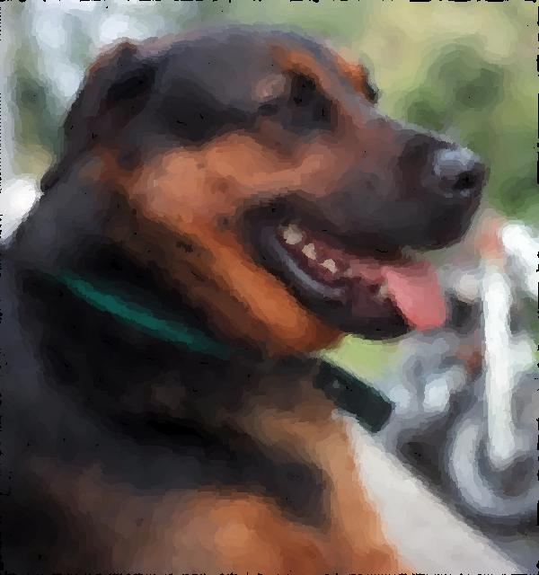 By using our extensions we can generate the following displacement map: 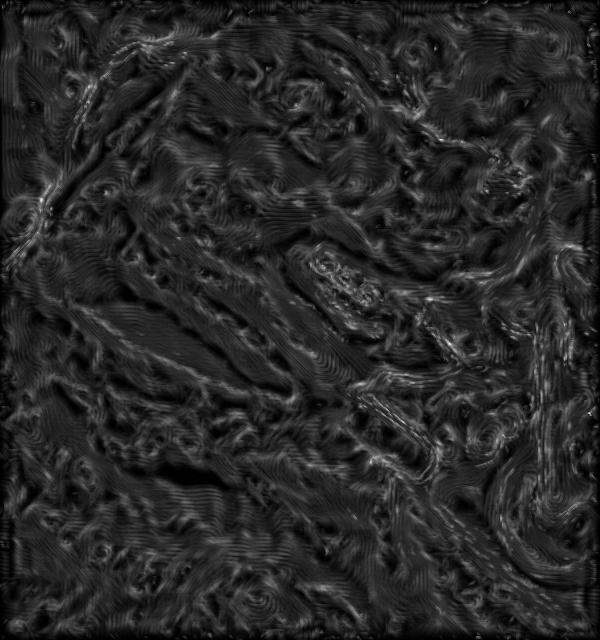 And finally, by applying some lighting and re-rendering with the displacement map, we get the following: Animating the lights gives us a better cue as to the depth of the brush strokes. The following animation shows light moving across the painting. [12,366k AVI] (This animation can also be found at /h/35/csc2530/gelkoura/litdog.avi on the University of Toronto's CSLab filesystem, for those who have access and don't wish to down the 12+MB file. A Humble TributeHere is another image produced by our system. The nib used was: The original image: 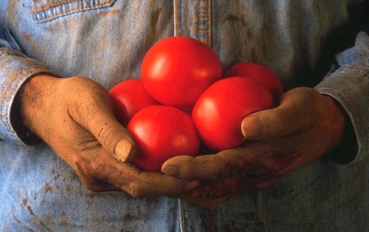 The flat painting: 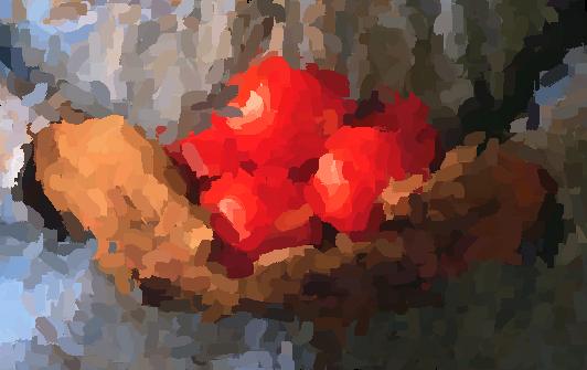 The displacement map: 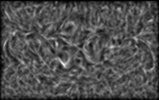 And finally the rendered painting: 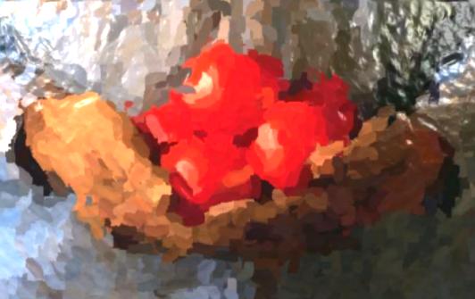 Again, the highlights and the height of the strokes are exaggerated and the lights are placed to show off the system and not to achieve the best artistic result. |
|
Simulating The Canvas |
|||
|
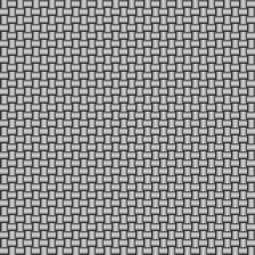
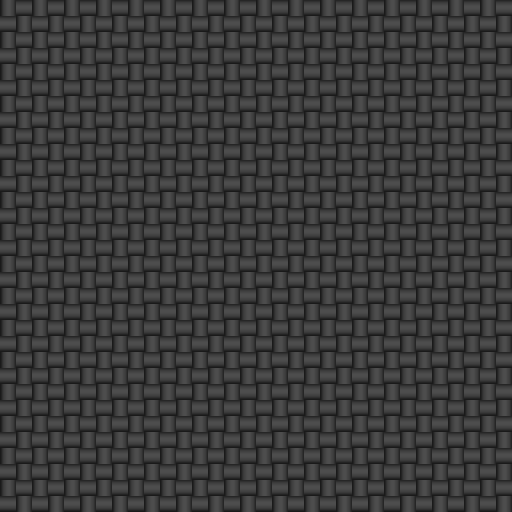
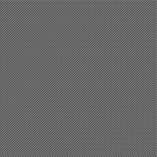
During a trip to the Antique Market, I suddenly realized that a good portion of the lighting information in a painting is portrayed through the texture of the canvas. Thus, I decided to simulate this interaction to achieve a better 3D effect. The canvas in my implementation is represented as a square weave pattern and is only applied to the height (alpha) plane. Before the algorithm starts painting, the canvas is drawn and paint stroke heights are added to those heights and normlaized later. Our initial approach was to simply add and cap as we went along, unfortunately, for a complicated stroke pattern we quickly reach the cap and all height information is as good as lost. Instead, we accumulate the height, loop through to find the pixel with the greatest height and then divide all other pixels by this value. Thus we normalize the height map and we get good results for any stroke pattern. The user can specify the density of the canvas and the height of the weave. Here are some examples of the displacement maps that are generated by the system. Click on each picture to get a larger version.
Butterfly on CanvasThe following pictures illustrate the effect the canvas can have on a painted image. The original image is a picture of a butterfly. 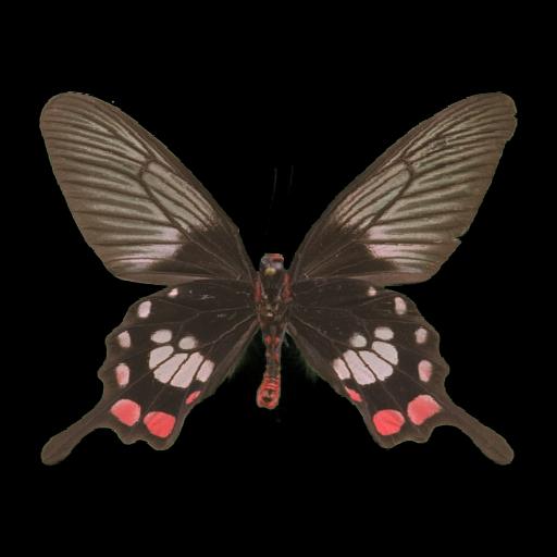 Running the above image through the system produces the following flat painting. 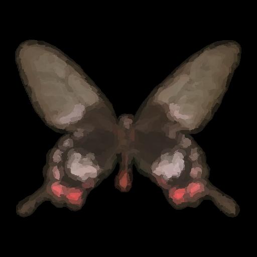 The displacement map generated without simulating the canvas, just the depth of the strokes is: 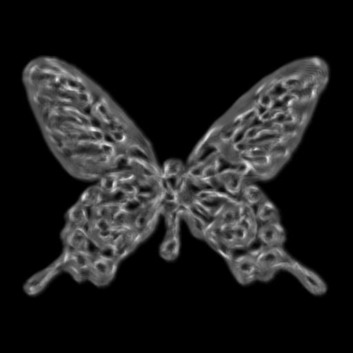 Now rendering the painting with lighting information, the above texture map and displacement map, we get the following 3D look to the painting: 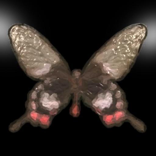 There seems to be something missing in the above image. It doesn't look complete, nor does it look believable. It looks as though the paint is smeared on a perfect surface. Such surfaces are hard to find in real life, and artists have a hard time keeping the paint on them. So we add the canvas texture. Below is a 4x4 canvas displacement map.  The following image uses only the canvas as a displacement map, and does not account for the depth of the brush strokes. 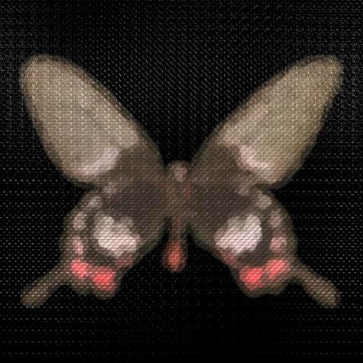 This image is more believable than using just the depth of the strokes. Below is a displacement map with both the canvas and the brush stroke height. 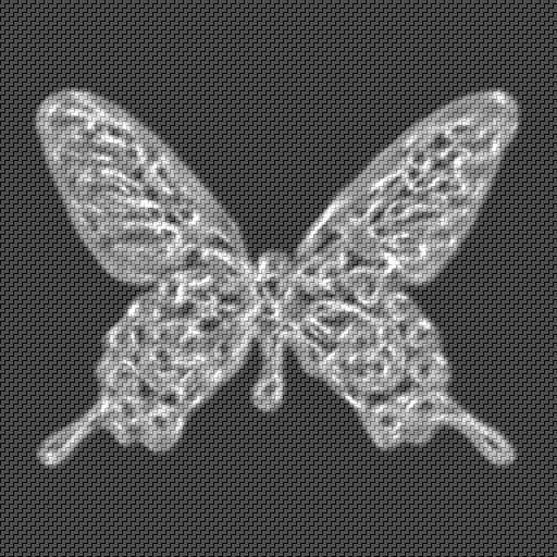 Finally, we get the best of these images, using both the canvas and the brush stroke heights. Notice how the strokes are added to the canvas and we can still see the canvas through the paint strokes. 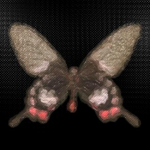 The reason this particular image was chosen to display the effect of the canvas is because it has a constant background and such images look unfinished when rendered without the canvas texture as displayed above. As in all the images on this page, the highlights are exaggerated to illustrate the results, an artist would make them more subtle. |
|
Painted Video |
|
We implemented a frame-to-frame coherence technique described by Hertzmann and Perlin in [3]. This technique uses a "Paint Over" metaphor where the results from the previous frame are used as a starting point for the current frame. Simply using the previous frame may still produce flickering. Instead, they also recommend adding an error tolerance check between frames to prevent strokes from being drawn where the error is below a threshold. We ran the algorithm on the same sequence, once using the described frame-to-frame coherence, and again without any coherence (i.e. applying the algorithm separately for each frame.) Note that for the case where coherence was not applied, the order of the strokes, though random, was the same for each stroke (the seed was identical). This produces less flickering than would otherwise be seen. Hertzmann and Perlin recommend using summed-area tables, which would have made calculations a good deal faster at the expense of a larger memory footprint. Summed-area tables give us the sum of an area in constant time as opposed to something on the order of O(n2). Our implementation did not make use of summed-area tables and we instead integrated manually. To render this video we used three brushes of size 16, 8, and 4, with a minimum and maximum stroke length of 2 and 10 respectively, and the grid sampling was done at 25% of each brush size. 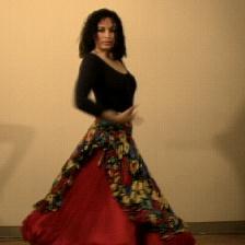 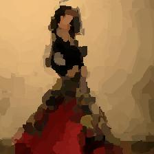 Original Video [1,534k] Painted Video without Coherence [743k] Painted Video with Coherence [680k] The video without coherence shows clearly that each successive frame has been painted independently of each other. Thus we see jumps in the strokes and flickering. As noted above, since the pixels of a frame are sampled in the same order, and the strokes are rendered in the same random order, we don't get as much flickering as we would expect if we rendered the strokes in a randomly for each frame. The video produced with coherence shows the "paint-on-glass" effect mentioned in [3]. Also, using coherence reduces the number of strokes that have to be rendered and thus the video with coherence was much faster to render. The disadvantage is that not using a high-enough error tolerance, (as shown here) will leave some strokes behind that look out of place. While there is less flickering, and the paint strokes look as though they are swimming on the canvas, I personally don't find the results particularly exciting. The 3D paint effects can be more appreciated on still frames and were thus not included in the above video, though nothing in the system prevents the user from producing video with the 3D effects that were the focus of this project. The video frame-to-frame coherence was implemented for completeness. |
|
Conclusions |
|
I tried to simulate the interaction of light with oil paints on a canvas. I found that the results are promising and may lead to work that will eventually produce very convincing image-based paintings. The most exciting work was done on trying to simulate the various aspects of a painting, and through it I learned to appreciate real-world paintings a great deal more. Video coherence was only implemented for completeness and was not very exciting. While working on this project, I was most impressed by the number of little things we could try to improve the quality of the painting. For example, though I didn't expand on it much on this webpage, I thought it would be neat to simulate the speed of the brush stroke. So instead of hard-coding the sampling rate along a curve I exposed it to the user. Unfortunately the sampling is still uniform and so the results are exactly special and were left out. But it serves to show how much experimentation can go into a project like this. After all, to paraphrase, the quality of the results are in the eyes of the beholder. An idea for future work, is trying to simulate the interaction of colors of overlapping brush strokes. We simulated this interaction in the height field only, and not in color. Also, another big drawback for realism is the system's use of a constant color per stroke. Seldom do oil paint artists use a single color in a stroke. The mixing of colors is very important. Overall, I found the results very encouraging and I like having an open ended system to play with to try to produce paintings that are more and more convincing. |
|
Acknowledgements |
I would like to thank the entire staff at Side Effects Software for being incredibly supportive and for providing a wonderful work environment and for producing amazing tools. |
|
References |
|